4 Design Hacks to Transform Boring UI Into Engaging Experiences
Tired of flat, lifeless interfaces? Learn 4 proven design hacks to add context, motion, and personality to your UI—or just use Monet.

You've built your landing page. The code works. The layout is clean. Everything is... perfectly boring.
Your hero section sits there like a corporate PowerPoint slide. Your pricing cards look like every other SaaS website. Visitors scroll past without a second glance because nothing catches their eye, nothing holds their attention.
Here's the problem: functional UI isn't enough. In 2025, users expect interfaces that feel alive, responsive, and thoughtfully crafted. The difference between "this works" and "I want to use this" comes down to a few critical design decisions.
In this guide, you'll learn 4 design hacks that transform static, boring interfaces into engaging experiences—and why you might not need to implement any of them yourself.
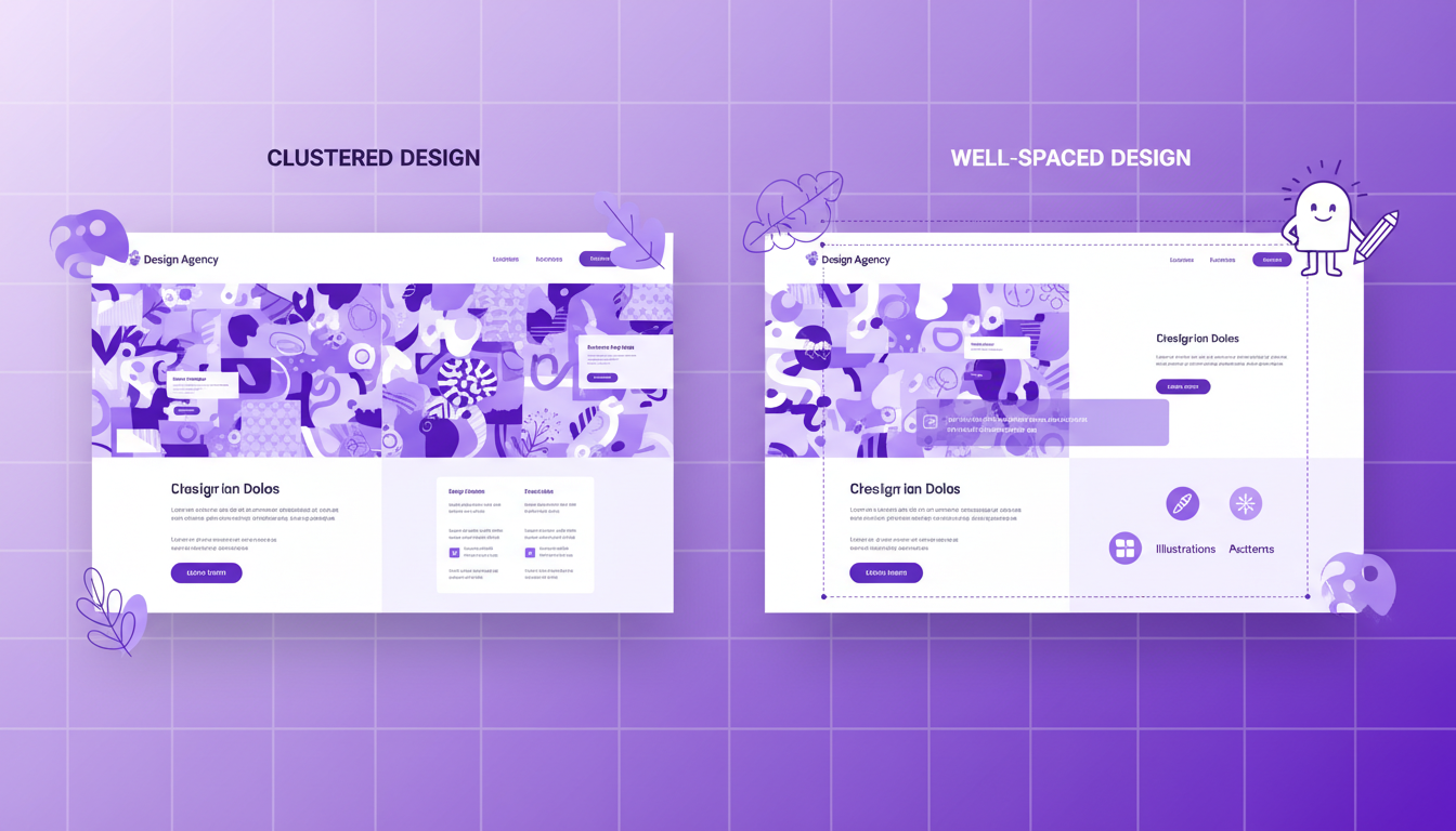
Design Hack #1: Add Context, Not Just Elements
The minimalist design trend taught us to remove everything unnecessary. But here's what most developers get wrong: removing too much creates emptiness, not elegance.
A hero section with just a headline and button isn't minimal—it's bare. Users need contextual elements that tell a story, create atmosphere, and guide their eyes.
What Contextual Elements Do
Contextual elements aren't decorative clutter. They serve specific purposes:
- Set the mood: Illustrations and visual accents establish your brand's personality
- Guide attention: Strategic placement directs eyes toward your primary message
- Provide breathing room: Proper spacing prevents elements from feeling cramped
- Tell a story: Supporting visuals reinforce what your product does
How to Implement Context
Use illustrations and doodle-style graphics that relate to your product:
// Adding contextual illustrations
<section className="relative overflow-hidden px-6 py-24">
  {/* Background grid pattern for tech context */}
  <div className="absolute inset-0 bg-grid-pattern opacity-10" />

  {/* Floating element illustrations */}
  <div className="absolute top-20 right-10 animate-float">
    <CodeIcon className="h-16 w-16 text-purple-400/30" />
  </div>

  <div className="absolute bottom-20 left-10 animate-float-delayed">
    <SparklesIcon className="h-12 w-12 text-pink-400/30" />
  </div>

  {/* Your main content */}
  <div className="relative z-10 mx-auto max-w-4xl text-center">
    <h1 className="text-6xl font-bold">Your Headline</h1>
    <p className="mt-6 text-xl text-gray-400">Your description</p>
  </div>
</section>
Maintain proper spacing so elements feel intentional, not cluttered:
// Good spacing creates context, not clutter
<div className="space-y-16">
  {/* Each section has breathing room */}
  <div className="space-y-4">
    <h2 className="text-3xl font-bold">Feature One</h2>
    <p className="text-lg text-gray-600">Description with proper line-height</p>
  </div>

  <div className="space-y-4">
    <h2 className="text-3xl font-bold">Feature Two</h2>
    <p className="text-lg text-gray-600">Another description</p>
  </div>
</div>
Match your design vibe consistently across components. If your hero has a playful, gradient-heavy aesthetic, your features section shouldn't suddenly be corporate and flat.
The Problem with DIY Context
Here's the catch: adding contextual elements sounds simple, but executing it well requires:
- Design sense to choose the right illustrations
- CSS skills to position elements without breaking layout
- Animation knowledge to make floating elements feel natural
- Time to iterate until spacing feels right
Most developers spend hours tweaking top: 20px vs top: 24px instead of building features.
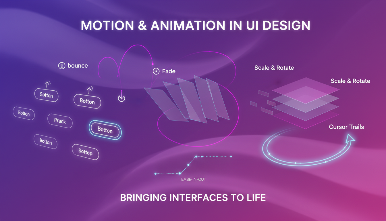
Design Hack #2: Use Motion to Bring Interfaces to Life
Static designs feel lifeless because real-world interfaces aren't static. Motion creates perceived responsiveness—the feeling that your interface is reacting to users, not just displaying information.
Types of Motion That Work
Subtle entrance animations make content feel like it's appearing for the user, not just loading:
// Fade in as elements enter viewport
<div className="opacity-0 animate-fadeIn">
  <h2>Your Content</h2>
</div>

// Slide up on scroll
<div className="translate-y-8 opacity-0 animate-slideUpFade">
  <p>Description text</p>
</div>
Micro-interactions on hover provide instant feedback:
// Button with subtle lift
<button
  className="px-8 py-4 bg-purple-600 rounded-lg
  transition-all duration-200
  hover:-translate-y-1 hover:shadow-xl
  active:translate-y-0"
>
  Get Started
</button>

// Card with gentle rotation
<div
  className="p-6 rounded-xl border border-gray-200
  transition-transform duration-300
  hover:rotate-1 hover:scale-105"
>
  <h3>Card Title</h3>
</div>
Parallax effects create depth and dimensionality:
// Different scroll speeds for layered effect
<section className="relative">
  <div className="scroll-slow">
    <Image src="/background.png" alt="Background" />
  </div>

  <div className="scroll-normal relative z-10">
    <h1>Your Content</h1>
  </div>

  <div className="scroll-fast">
    <SparklesIcon />
  </div>
</section>
Mouse-tracking interactions add playfulness:
// Card that tilts based on mouse position
"use client";

export function InteractiveCard() {
  const [rotation, setRotation] = useState({ x: 0, y: 0 });

  const handleMouseMove = (e: React.MouseEvent<HTMLDivElement>) => {
    const rect = e.currentTarget.getBoundingClientRect();
    const x = (e.clientX - rect.left) / rect.width - 0.5;
    const y = (e.clientY - rect.top) / rect.height - 0.5;

    setRotation({ x: y * 10, y: x * 10 });
  };

  return (
    <div
      onMouseMove={handleMouseMove}
      onMouseLeave={() => setRotation({ x: 0, y: 0 })}
      style={{
        transform: `perspective(1000px) rotateX(${rotation.x}deg) rotateY(${rotation.y}deg)`,
        transition: "transform 0.1s ease-out",
      }}
      className="p-6 bg-gradient-to-br from-purple-500 to-pink-500 rounded-2xl"
    >
      <h3 className="text-2xl font-bold text-white">Interactive Card</h3>
    </div>
  );
}
The Motion Implementation Problem
Motion design requires:
- Understanding animation performance (60fps, GPU acceleration)
- Handling edge cases (reduced motion preferences)
- Balancing subtlety with noticeability
- Cross-browser testing (Safari handles transforms differently)
- JavaScript for complex interactions
A simple "hover effect" can spiral into hours of animation tuning.
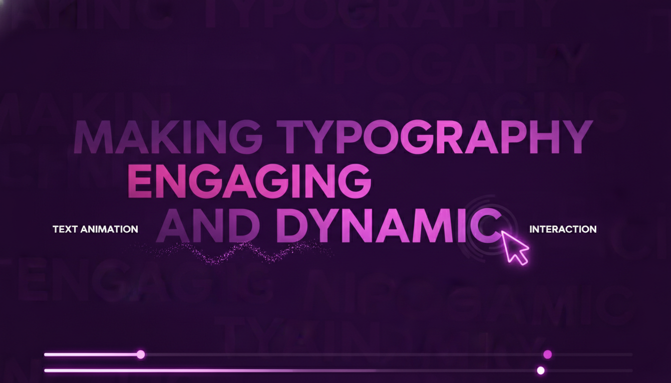
Design Hack #3: Animate Your Text
Here's a stat that matters: text comprises 80% of most landing pages. If your text is static, 80% of your interface feels dead.
Text animation isn't about making words dance—it's about creating visual interest in the dominant element of your page.
Text Animation Techniques
Staggered fade-in for headlines:
// Each word appears sequentially
export function StaggeredHeadline() {
  const words = ["Build", "Faster", "Ship", "Better"];

  return (
    <h1 className="text-6xl font-bold">
      {words.map((word, i) => (
        <span
          key={word}
          className="inline-block opacity-0 animate-fadeIn"
          style={{ animationDelay: `${i * 0.1}s` }}
        >
          {word}{" "}
        </span>
      ))}
    </h1>
  );
}
Gradient text with shifting colors:
// Animated gradient text
<h1 className="text-6xl font-bold bg-gradient-to-r from-purple-400 via-pink-500 to-purple-400 bg-clip-text text-transparent bg-[length:200%_auto] animate-gradient">
  Beautiful Animated Text
</h1>

// In your CSS/Tailwind config
@keyframes gradient {
  0%, 100% { background-position: 0% 50%; }
  50% { background-position: 100% 50%; }
}
Typewriter effect for emphasis:
// Progressive text reveal
export function TypewriterText({ text }: { text: string }) {
  const [displayed, setDisplayed] = useState("");

  useEffect(() => {
    let i = 0;
    const interval = setInterval(() => {
      setDisplayed(text.slice(0, i));
      i++;
      if (i > text.length) clearInterval(interval);
    }, 50);

    return () => clearInterval(interval);
  }, [text]);

  return <p className="text-xl">{displayed}<span className="animate-pulse">|</span></p>;
}
Interactive hover states on text elements:
// Text that responds to hover
<p className="text-lg group cursor-pointer">
  Hover me to see{" "}
  <span className="text-gray-400 transition-all duration-300 group-hover:text-purple-500 group-hover:font-bold">
    emphasis
  </span>
</p>

// Link with animated underline
<a
  href="/guide"
  className="relative inline-block after:absolute after:bottom-0 after:left-0 after:h-0.5 after:w-0 after:bg-purple-500 after:transition-all hover:after:w-full"
>
  Learn more
</a>
The Text Animation Challenge
Animating text properly requires:
- JavaScript for complex sequences
- Performance optimization (animating thousands of characters)
- Accessibility considerations (motion sickness, screen readers)
- Responsive design (animations that work on mobile)
Each text animation is a mini-project.
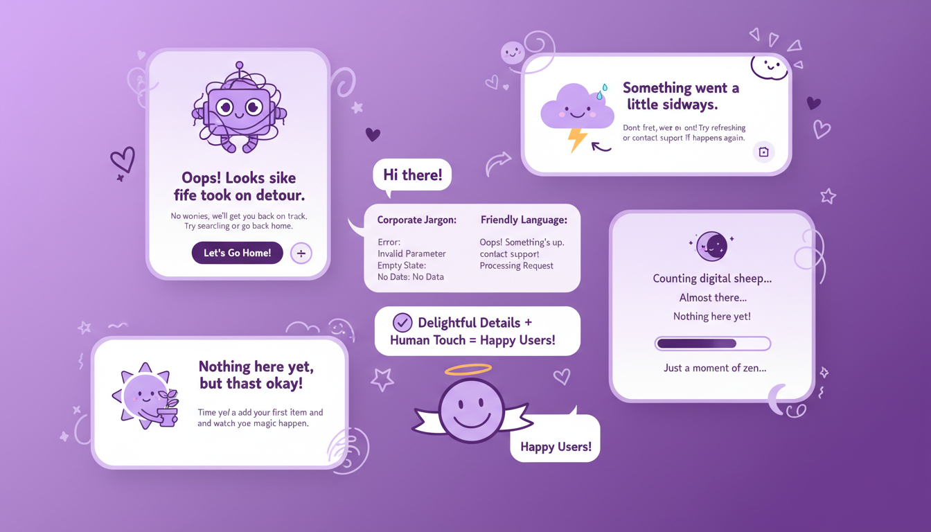
Design Hack #4: Add Personality Through Copy and Details
Technical excellence doesn't create emotional connection. Personality does.
Your UI can have perfect spacing and beautiful animations, but if your copy sounds like corporate jargon and your error states are generic, users won't feel anything.
Write Like a Human
Replace corporate-speak with conversational language:
// ❌ Corporate and boring
<h1>Enterprise-Grade Solutions for Modern Businesses</h1>
<p>Leverage our innovative platform to optimize workflows</p>

// ✅ Human and engaging
<h1>Build your landing page this weekend</h1>
<p>Copy, paste, ship. No wrestling with CSS or debating hex codes.</p>
Make error states helpful and friendly:
// ❌ Generic error
<div className="text-red-500">Error: Invalid input</div>

// ✅ Helpful and friendly
<div className="p-4 bg-red-50 border border-red-200 rounded-lg">
  <p className="font-semibold text-red-900">Hmm, that email doesn't look quite right.</p>
  <p className="text-sm text-red-700">
    Did you mean to include an @ symbol? Try something like hello@example.com
  </p>
</div>
Add Delight in Unexpected Places
404 pages are opportunities, not failures:
// Playful 404 page
export function NotFound() {
  return (
    <div className="flex min-h-screen flex-col items-center justify-center px-6">
      <h1 className="text-9xl font-bold text-purple-500">404</h1>
      <p className="mt-4 text-2xl font-semibold">This page went on vacation</p>
      <p className="mt-2 text-gray-600">
        (We asked it to come back, but it's not responding to emails)
      </p>
      <Button className="mt-8" href="/">
        Take me home
      </Button>
    </div>
  );
}
Loading states can be entertaining:
// Fun loading messages
const loadingMessages = [
  "Waking up the hamsters...",
  "Consulting the design gods...",
  "Sprinkling pixel dust...",
  "Almost there...",
];

<div className="flex items-center gap-3">
  <Spinner />
  <p className="text-gray-600">{randomMessage}</p>
</div>
Empty states should guide, not frustrate:
// Helpful empty state
<div className="py-16 text-center">
  <InboxIcon className="mx-auto h-16 w-16 text-gray-300" />
  <h3 className="mt-4 text-lg font-semibold">No components saved yet</h3>
  <p className="mt-2 text-gray-600">
    Browse the gallery and save your favorites for quick access
  </p>
  <Button className="mt-6" href="/c">
    Explore Components
  </Button>
</div>
The Personality Problem
Adding personality sounds easy, but it requires:
- Copywriting skills most developers don't have
- Consistent tone across hundreds of UI states
- Design time to create custom illustrations
- Ongoing maintenance as features change
Most teams skip personality because they're rushing to ship features.
The Pattern You've Probably Noticed
Each of these design hacks transforms boring UI into engaging experiences. Each one is also time-consuming, technically complex, and hard to get right.
- Contextual elements require design sense and positioning skills
- Motion needs animation expertise and performance knowledge
- Text effects demand JavaScript and accessibility consideration
- Personality requires copywriting and consistent execution
Here's the reality: you can spend weeks implementing these principles, or you can just use Monet.
Why Monet Solves This Entirely
Every component in Monet's gallery already implements these design hacks:
Contextual elements are built-in: Hero sections include background patterns, floating icons, and strategic visual accents positioned by professional designers.
Motion is pre-tuned: Hover states, entrance animations, and micro-interactions are already implemented with proper timing curves and performance optimization.
Text comes alive automatically: Gradient effects, staggered animations, and interactive states are included in relevant components.
Personality is embedded: Copy is conversational, empty states are helpful, and error handling is friendly.
The "Just Use Monet" Approach
Instead of spending hours implementing design principles:
- Browse the component gallery and find what you need
- Copy the component into your project
- Customize the content to match your brand
- Ship immediately with professional-quality design
// A Monet hero section already has:
// - Contextual background elements
// - Subtle animations on load
// - Gradient text effects
// - Proper spacing and layout
// - Mobile responsiveness

export function Hero() {
  return (
    <section className="relative overflow-hidden bg-gradient-to-br from-purple-900 via-purple-800 to-indigo-900 px-6 py-32">
      {/* Background grid pattern (context) */}
      <div className="absolute inset-0 bg-grid-white/[0.02]" />

      {/* Floating elements (context + motion) */}
      <div className="absolute -top-10 -right-10 h-72 w-72 rounded-full bg-purple-500/30 blur-3xl animate-pulse" />

      <div className="relative mx-auto max-w-4xl text-center">
        {/* Animated gradient text */}
        <h1 className="text-6xl font-bold tracking-tight text-white sm:text-7xl animate-fadeIn">
          <span className="bg-gradient-to-r from-white via-purple-200 to-white bg-clip-text text-transparent">
            Build stunning landing pages
          </span>
        </h1>

        {/* Staggered fade-in description */}
        <p className="mt-6 text-xl leading-8 text-purple-100 animate-fadeIn" style={{ animationDelay: "0.2s" }}>
          Copy beautiful React components and ship your idea this weekend
        </p>

        {/* Interactive buttons with hover effects */}
        <div className="mt-10 flex items-center justify-center gap-x-6">
          <Button
            size="lg"
            className="transition-all duration-200 hover:-translate-y-1 hover:shadow-xl"
          >
            Browse Components
          </Button>
        </div>
      </div>
    </section>
  );
}
Everything is copy-paste ready. No animation libraries to configure. No design decisions to agonize over. No "does this spacing feel right?" iterations.
For AI-Assisted Workflows
If you're using Claude or other AI assistants, set up Monet MCP so your AI can discover and recommend components automatically:
claude mcp add --transport http monet-mcp https://www.monet.design/api/remote/mcp --header "Authorization: Bearer your-api-key-here"Your AI will suggest Monet components that already implement these design principles instead of generating inconsistent code from scratch.
The Bottom Line
Understanding design principles is valuable. Knowing how context, motion, animated text, and personality transform boring UIs into engaging experiences makes you a better developer.
But knowing the principles doesn't mean you have to implement them from scratch.
The four design hacks in this guide are already applied in Monet components. Every hero section, feature grid, pricing table, and CTA block comes with:
- Professional spacing and contextual elements
- Subtle, purposeful animations
- Engaging text effects
- Personality in copy and micro-interactions
Your choice is simple: spend weeks implementing these principles yourself, or spend minutes browsing Monet and copying what you need.
Just use Monet. Start building at the component gallery, or learn more in the documentation.
Stay Updated
Get the latest tutorials, tips, and component updates delivered to your inbox.


